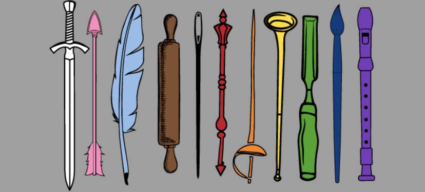
At the end of March, the SCA announced the availability of a t-shirt being sold as a fundraiser for the Society’s Office of Diversity, Equity, and Inclusion.

I am always glad to see the Society taking steps to promote inclusion, and in general I like the design of this shirt, but I was one of several people who wryly noted that the placement of the of the white chivalric arming sword as the first item, and just a bit larger than any of the other items, somewhat undercut the message.
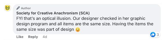
However, I was somewhat startled to find that the SCA’s official Facebook account was assuring people that this wasn’t actually the case, and insisting that all of the items were the same size:
This seemed to be objectively untrue, so I write to the communications office requesting clarification:
Hello,
I love the idea behind the new t-shirt, and I’m glad to see the SCA putting more effort into DEI projects.
However, I am writing to request clarification on the specific design that is being printed.
Attached is a copy of the design currently available from the vendor.
https://www.customink.com/fundraising/sca-dei-fundraiser?type=1&zoom=trueIn a discussion on Facebook, the SCA’s official account responded to a comment about the varying sizes of the design elements by saying the following:
FYI that’s an optical illusion. Our designer checked in her graphic design program and all items are the same size. Having the items the same size was part of design 🙂
To defuse the accusations of gaslighting, I would greatly appreciate it if you could please share an image of the final design to be printed that would allow people to verify that, for example, the white sword and the black needle are “the same size.”
Thank you for your service,
— Mathghamhain Ua Ruadháin, East Kingdom
I’ll update this post if there’s a reply.
[Update, April 17:] I was pleased to receive a prompt reply from the Society Communications/Social Media officer, who promised to look into it further.
The following day, the Facebook comment was edited to retract the misstatement:
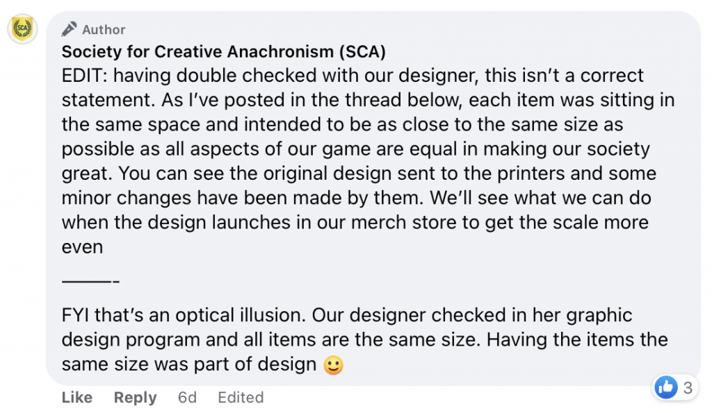
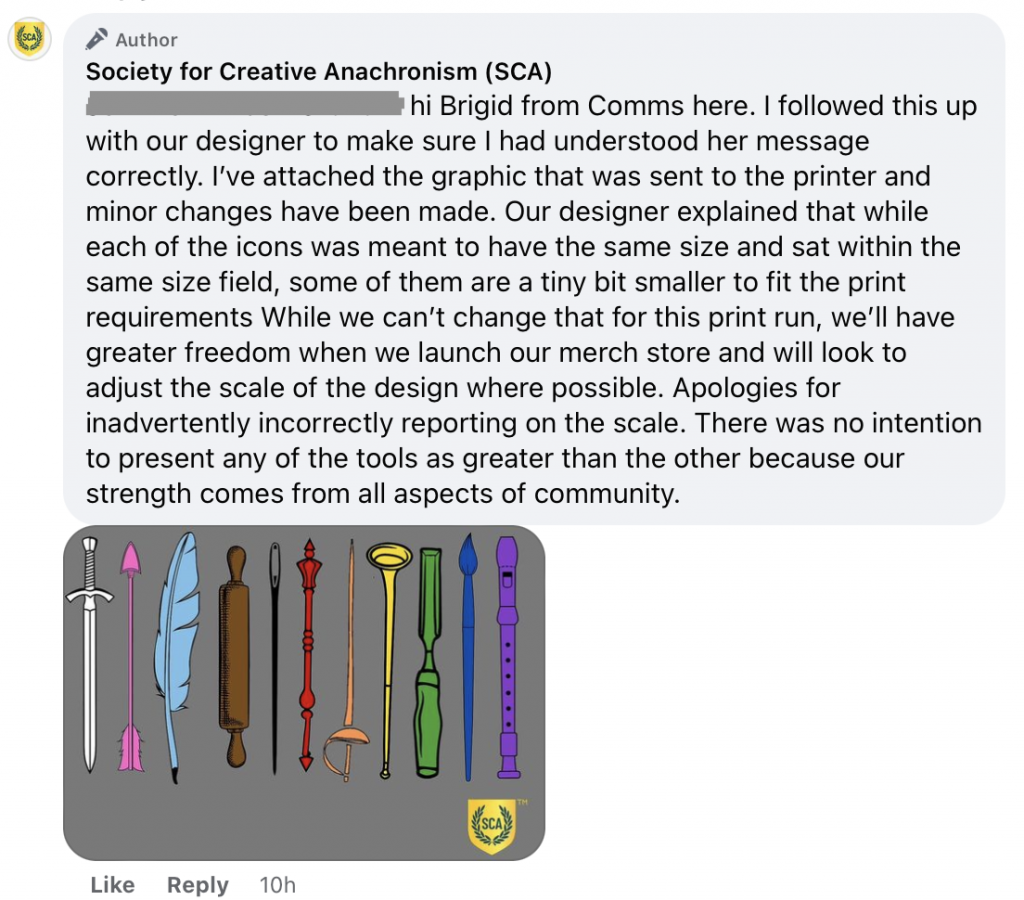
A separate clarification was added in reply to one of the other participants in the thread:
I’m still not sure I fully understand the purported sequence of events — What “print requirements” forced the black needle to be ten percent shorter than the blue feather? What “minor changes” were made to the design by the printing company? What was the misunderstood message that led to the “optical illusion” claim? What design is going to show up on the actual t-shirts that are scheduled to be printed later this month? — but having received a public correction, I’m going to score this as a win and leave it there.